It was easy to start. I had prepared the templates in advance.
I once heard someone say that creating templates in advance makes it easier to start development, so I took the time to create starter templates for Next.js and Flutter.
I really think it was a good decision to do this. Since I set this up, it doesn't take time to start, so I'm feeling good because it can be pushed forward right away.
Personally, I tend not to use templates made by others. Since I create my own, it seems easier to apply directly because I know my coding style and how much maintenance it has undergone.
If I set this up as a GitHub template, starting a project would be very easy, so please do it.
Applying Color Themes
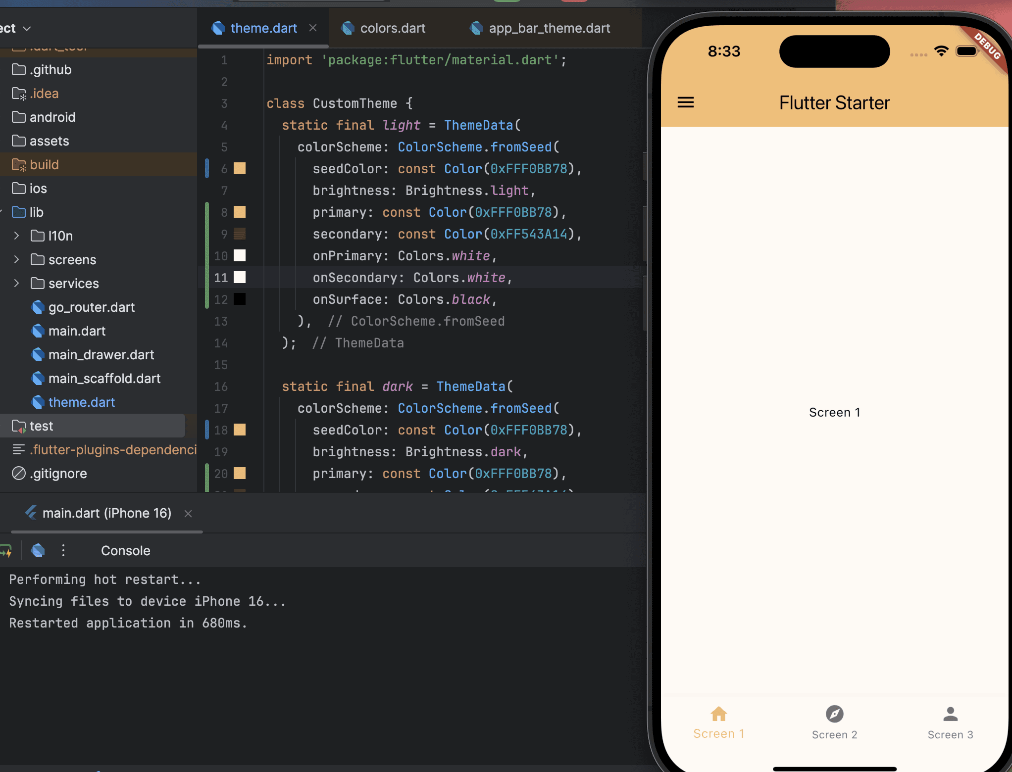
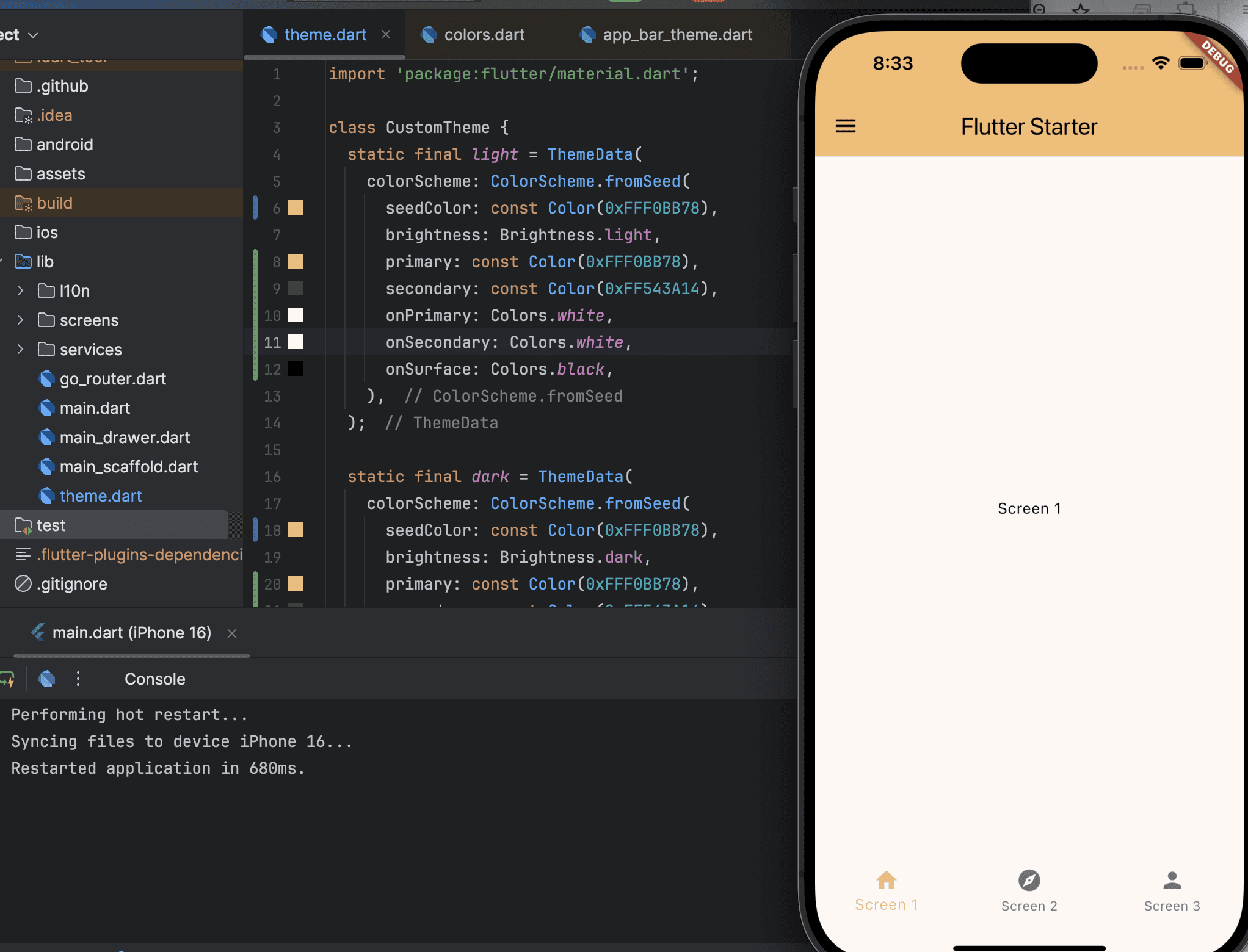
In the previous post, there was a pre-defined color palette, so you can apply it directly to the theme.
The template I created also has theme separation done in advance, making it very easy to specify the color palette.
import 'package:flutter/material.dart';

class CustomTheme {
  static final light = ThemeData(
    colorScheme: ColorScheme.fromSeed(
      seedColor: Colors.deepPurple,
      brightness: Brightness.light,
    ),
  );

  static final dark = ThemeData(
    colorScheme: ColorScheme.fromSeed(
      seedColor: Colors.deepPurple,
      brightness: Brightness.dark,
    ),
  );
}
Now I can apply my color palette here.
import 'package:flutter/material.dart';

class CustomTheme {
  static final light = ThemeData(
    colorScheme: ColorScheme.fromSeed(
      seedColor: const Color(0xFFF0BB78),
      brightness: Brightness.light,
      primary: const Color(0xFFF0BB78),
      secondary: const Color(0xFF543A14),
      onPrimary: Colors.white,
      onSecondary: Colors.white,
      onSurface: Colors.black,
    ),
  );

  static final dark = ThemeData(
    colorScheme: ColorScheme.fromSeed(
      seedColor: const Color(0xFFF0BB78),
      brightness: Brightness.dark,
      primary: const Color(0xFFF0BB78),
      secondary: const Color(0xFF543A14),
      surface: const Color(0xFF131010),
      onPrimary: Colors.black,
      onSecondary: Colors.white,
      onSurface: Colors.white,
    ),
  );
}
The results are about this much. I will continue to fine-tune it and change any strange parts.
Adding the First Page
As mentioned earlier, the most important function is to cherish precious memories. For this, I think a gallery-style UI is the most intuitive. Therefore, I decided to use card and grid components that display several photos immediately in a gallery format on the first page.
body: ListView.builder(
padding: const EdgeInsets.all(16),
itemCount: 1,
itemBuilder: (context, index) {
return InkWell(
onTap: () {},
borderRadius: BorderRadius.circular(12),
child: Card(
margin: const EdgeInsets.only(bottom: 16),
elevation: 4,
shape: RoundedRectangleBorder(
borderRadius: BorderRadius.circular(12),
),
child: Padding(
padding: const EdgeInsets.all(16),
child: Column(
crossAxisAlignment: CrossAxisAlignment.start,
children: [
ListTile(
contentPadding: EdgeInsets.zero,
title: const Text('Dad'),
subtitle: const Text('~ 2025.02.16'),
trailing: const Icon(Icons.arrow_forward_ios),
),
const SizedBox(height: 12),
GridView.builder(
shrinkWrap: true,
physics: const NeverScrollableScrollPhysics(),
itemCount: 9,
gridDelegate:
const SliverGridDelegateWithFixedCrossAxisCount(
crossAxisCount: 3,
mainAxisSpacing: 8,
crossAxisSpacing: 8,
childAspectRatio: 1,
),
itemBuilder: (context, i) {
return Container(
decoration: BoxDecoration(
borderRadius: BorderRadius.circular(8),
color: Colors.grey[300],
),
);
},
),
],
),
),
),
);
},
),
I decided to display the images in a grid view like this, and the result looks like this screen. Based on a structure that can contain multiple memories, I concluded with a list view containing the name of the person whose memories are being cherished, the period spent together, and the gallery.
Since the list needs actions to add items, I simply added a Floating Action Button to the Scaffold.
floatingActionButton: FloatingActionButton(
    child: Icon(Icons.add),
    onPressed: () {},
  ),
To conclude, this is the initial form.

It seems like a long way to go, but it doesn't seem bad as a start.